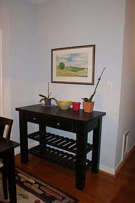
Here is the final product, which we are both very happy with! I am still waiting to hear her husband's verdict once he returns home this evening!
Here is the original concept board I presented to her:
Okay, before we really get started, check out the before pictures:

And now, for the after...
We used a bold color and design on the floor to brighten up the room. The chairs were recovered with another fun geometric print. The window treatments were definitely a major focal point in the space.

The window treatments were hung higher than the window frame to allow in more sunlight and utilize the full height of the room.
Susie's mother had previously given her a beautiful painting of her hometown (see below). I made sure to incorporate the colors by choosing accessories that were complimentary and would make it pop!
So, what do you think?


It is fantastic - I absolutely LOVE it!!
ReplyDelete